Swiftype
My year at Swiftype gave me the opportunity to quickly become a product designer and sharpen my brand and illustration skills. Laterally working on branding and product design helped unify the user experience from website to dashboard.
Two products
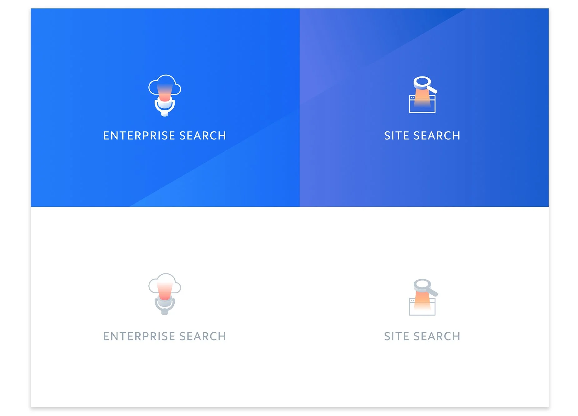
Swiftype offered 2 products: Site Search and what was referred to as Enterprise Search. The challenge was to work on an overall brand while giving the two brands a visual cue to differentiate themselves from one another. A year into my work on Swiftype, we were acquired by Elastic.
The website
The goal: Introduce 2 products while speaking to the overall search technology. How does the underlying goal of finding what you need speak to 2 different customers?
Site Search
Search for your website
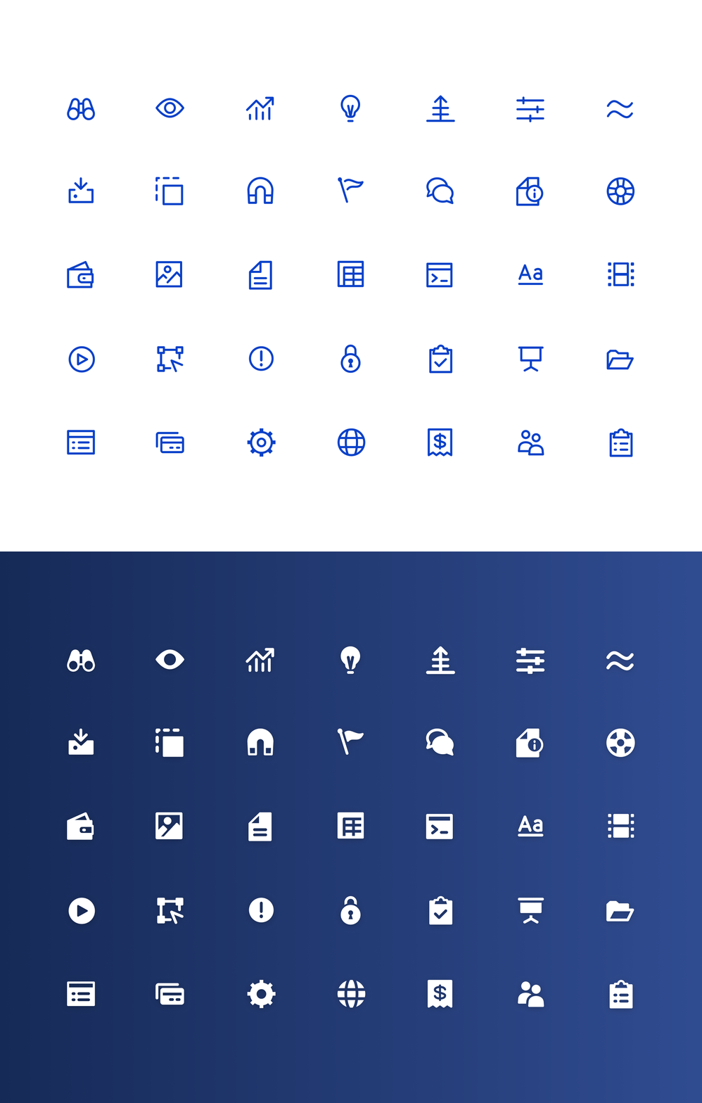
Iconography in the product
The site search dashboard was already created when I joined Swiftype, but after branding decision were made on the marketing site we decided to give it a lil reskin refresh.
Enterprise Search
Search for your workplace
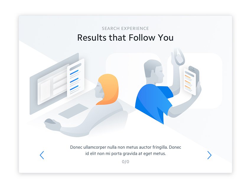
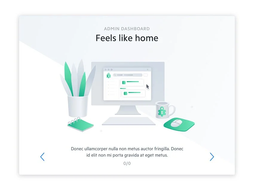
Illustration styles in modals
On boarding modals are always a great way to show style and branding within the product!


A lil bit of product design
working towards solutions within the product on a granular level, and putting them together to create larger system was both fun and fulfilling.
Search across applications at work
Enterprise Search (currently known as Workplace Search) is a platform for searching across applications that employees rely on on to get their jobs done more efficiently and successfully.
It’s about search results! How are they displayed? What is the balance between too much and just enough information? Keep it scan-able and obvious. Where do we start?
Filters and faucets. A user not only is looking through different applications, but within one application would want to sift through more granular levels. It was important to choose several highly used applications in the workplace to start diving into use cases.
Potential users were also our peers, so we interviewed them to see what triggers they would look for when scanning a lot of information. For our internal sales team, that meant asking about which fields were most important to them in products like salesforce.
Scan-able results
We’ve entered our query, now what?
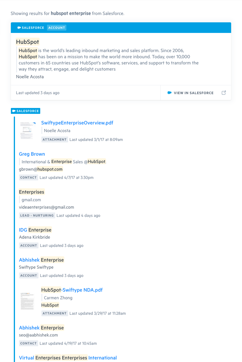
We went from simple wire frames but quickly moved into high fidelity designs to think about how different results could be viewed. Information hierarchy was determined with each connector. We asked questions like - how are the cells in the application chosen and displayed, how are attachments viewed, and how to keep this all on a maximum of 3 lines per result.
Although there were several versions of the whole screen view, this gave us a good idea what our users would see with populated data.


