The Elastic brand refresh: everything but the logo
When I joined the team, Elastic was in the midst of several acquisitions to broaden their product repertoire. I joined as an acquisition from Swiftype. When I scoped out my new employer I saw opportunity for a refresh. With this growing company came the need for something solid and scalable. There was a lot of brand equity in a lot of existing assets, and it was decided that the logo would stay, colors were
Typography + color palette
Logos and icons
I noticed there was an inconsistent and unscalable system of logo marks and icons on the website that represented solutions, products, features etc. There were no guidelines and no designated team or person owning the library. I talked with my new team and creative director and we decided that tackling the iconography would be a great way to kick off a visual brand refresh.
Product and solution logos
Right some wrongs
We decided to keep the basic structure of the existing product marks because of brand equity.
Write some rules
With more product logos being added, we needed to create a well-defined system with clear parameters.
2 color + black
geometric vs organic
1 color touching black (for the most part)
consistent negative space
Iconography
Where to start and why to refresh
The “why” was apparent, but the “where to start “ part was daunting. As you can see, there were many inconsistencies, in white space, color balance, stroke weight vs fill colors, overlay effect, etc. We opted for simple and scalable 2 tone with consistent line quality.
Write some rules
With some new additions
Defining solutions with patterns
How to visually define solutions while retaining a cohesive overall brand look? Branded patterns! Each solution has a main color taken from our overall palette and has pattern that plays off of the function of the solution.


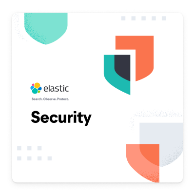
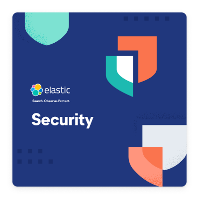



On the web
In collateral
Illustration styles
We are illustrative, that’s our brand. A lot of our illustrations help to support abstact concepts about our product. Search, analytics, security data visualizations are mixed in with our signature style to create something very distinct. I had the pleasure of exploring some illustrative parameters to come up with the current illustrations style





On the web
In collateral
Write some rules
Illustration rules
Campaign examples
Campaigns are a great way to promote brand awareness with out signature visual style across multiple marketing channels. Illustrations, iconography, typography, diagrams, product shots and infographics converge into a valuable marketing piece.
Process
A ticket is entered in Monday.com and usually a kickoff meeting is set. Ideally a link to any relevant copy or research is provided so we have the chance to prepare with questions.
Sometimes the “client” comes with ideas and sometimes they do not. Designers either sketch ideas or move into higher fidelity design to create several options depending on the project.
Communication remain open for questions and progress so we can deliver the best result. We go through internal design team reviews via slack and zoom before we post to external teams.
Once the design is approved we take care to optimize, localize, and save with the proper name, format and folder for easy access.
Collaboration
We have libraries and templates to help make this process easy and seamless. We use CC libraries to house our illustrations with our custom illustrator brush, Figma for web templates, and InDesign for longer form collateral pieces.
The look and feel of the campaign is usually handled in house, but often times various collateral like ebooks, white papers and even display ads are created by 3rd party agencies that we have relationships with.
Campaign Examples
The secret Ingredient…
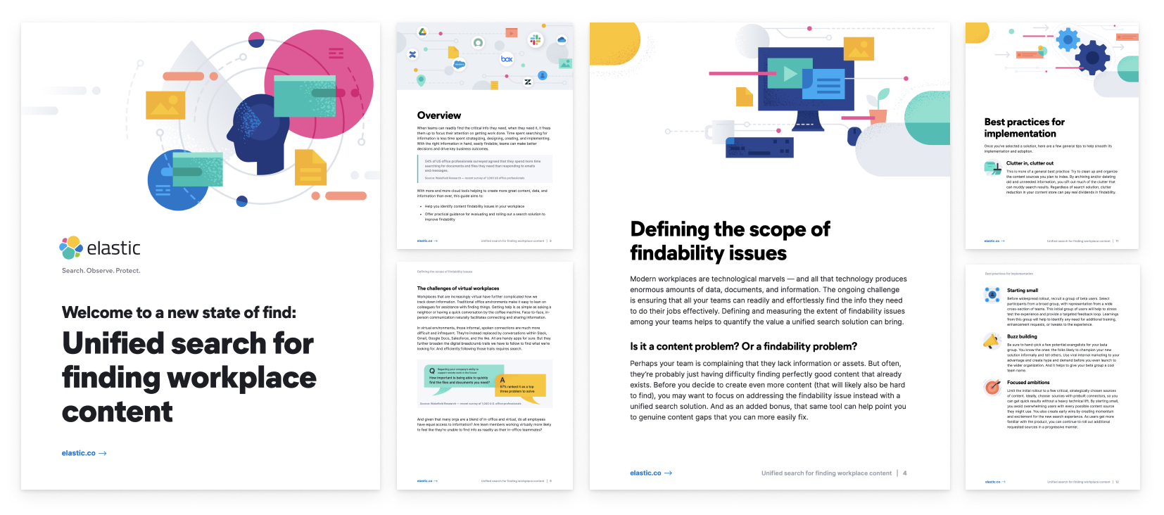
The Enterprise Search team has a really great group of content writers and we usually just set up a brainstorming session to go over copy and ideas and talk about visuals in real time. Here is an example of a conceptual ebook with accompanying graphics.
LinkedIn carousel ads
I was not the one to execute the adds but since we created all of the necessary illustrations and content, another designer was able to easily pull out necessary graphics. Design executed by Quique Fernandez.
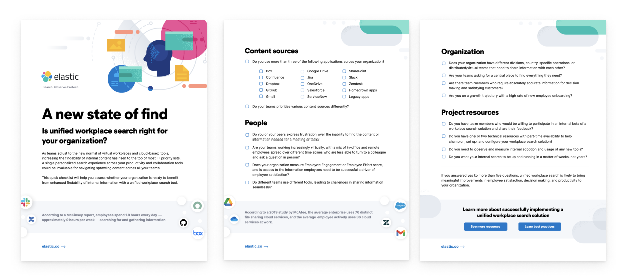
Workplace Search: A new state of find
LinkedIn ads
Layout and visual design of an interactive checklist
Layout and visual design of the ebook. Get it here.
Cloud Campaign
Who is the audience? Cloud campaign consisted of 2 rounds. The first round was high level with language that was not specific. Round 2 saw to tracks, one track with language and content for developers and one track for executive decision makers. The developer content focused on language about building new stuff and adding on to your existing product while executive level focused on cutting costs and insights.
We create style frames and story boards for videos in house and then send them to a team of animators that we work closely with. They are able to deliver quick explainer conceptual videos that we can use over and over again.
See the cloud overview video here
The fun stuff
There’s a lot of opportunities to apply our fun style to some fun stuff, like swag, murals and more.
The Source code
Elastic source code is engrained everywhere in our company culture. Check out the source code.


