kindroot™
Logo, branding, packaging and web design.
kindroot™’s first product is Adaptogems™, described as mini herbal resets. I call them delicious little lozenges that help me get through my days and nights. I paired up with my good friend Sara Buschkamp, copy writing, creative directing extraordinaire, packaging for multiple skus, a logo and branding, and a website.
Primary logo custom letterforms
Symbols
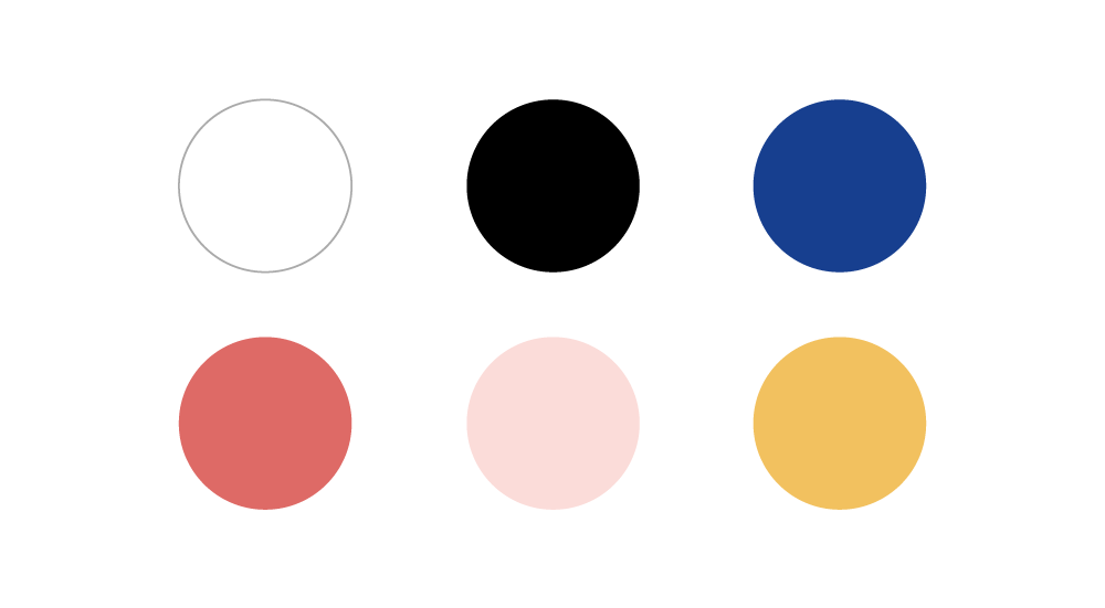
Primary Color Palette
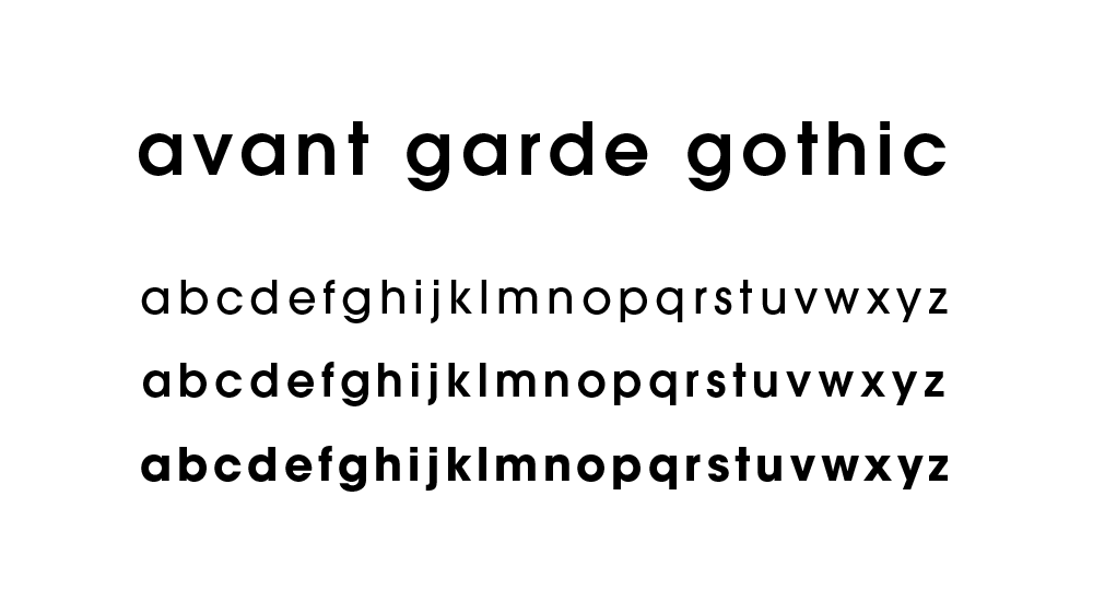
Typography
adaptogems™
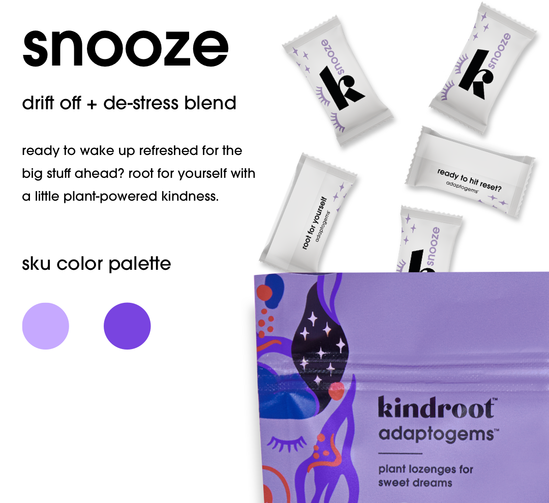
4 skus for adaptogenic lozenges
The challenge was to create 4 distinct sensory experiences while retaining an overall brand. By introducing sku specific color palettes, an illustrative style and smart language, we were able to create a formula for 4 distinct packages that stand out on the shelf.


kindroot™ website
UX, illustration, iconography, photo direction, photo compositing, etc
The website is straight to the point and puts the product front and center. I started to layout content in a simple wireframe, made it mobile ready, and then jumped into high fidelity design.
Stickers!
A little bit of hand-lettering, illustration and typographic fun, sticker sheets are always a fun way to add something special to a brand.
Shirts and bags!
Wearable swag is great when you’ve got super cute branded sayings to play with. We want to make sure our swag is wearable.


